
The customer has studied the measurements, chosen a color, and found a coat that suits the dog's routine. Below the purchase button, your store presents four more coats.
Perhaps that is helpful. Perhaps you have just reopened a decision the customer was ready to finish.
A recommendation block makes an editorial choice on your behalf. It can say, “Here are other ways to solve this problem.” Or it can say, “Here is something useful alongside the choice you have made.” The heading “You may also like” leaves that choice unexplained.
For a pet merchant, the difference deserves a deliberate plan.
Give the block one purpose
Shopify distinguishes related recommendations, which can offer similar alternatives, from complementary recommendations, which offer additions. Its theme documentation says related suggestions can be generated automatically, while complementary selections need manual setup.
Start with the question you want the block to answer. “Would you prefer a different fastening?” is an alternatives question. “Where will you keep training treats on this walk?” suggests an addition.
Neither deserves automatic priority. A customer who cannot find the right cut benefits from another coat. A customer satisfied with the coat may find a small walking accessory more relevant. A well-designed page can serve both, with clear labels and a sensible visual hierarchy.
Try the same-walk test
Consider an invented assortment: a rust wrap-front dog coat, an olive treat pouch worn by the handler, a pullover knit, and a ceramic feeding bowl. These are separate products, each with its own price and purchase decision.
The coat and pouch share an occasion. The knit is a possible substitute. The bowl belongs to the same broad pet category but needs a stronger reason to appear here.
“Sold to dog owners” is a weak connection. “Useful on the same walk” gives the merchant something concrete to explain.
| Candidate | Its possible role | What the customer needs to know |
|---|---|---|
| Treat pouch | Optional walking addition | How it is worn, dimensions, closure, and care |
| Pullover knit | Alternative garment | How the cut and dressing method differ |
| Ceramic bowl | Separate feeding purchase | Why it is relevant at this moment |
The table is a merchandising exercise, not evidence that these items are bought together. Purchase history can suggest a relationship; the merchant should still understand it.
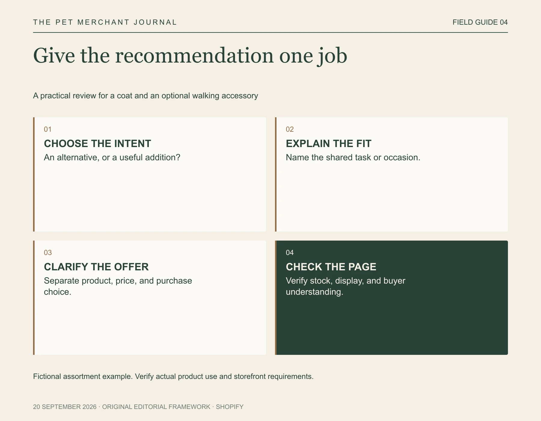
Original editorial framework. Fictional assortment example. Verify actual product use and storefront requirements.
For the pouch, a brief line could explain its role: “A separate pouch for carrying treats on your walk.” The image should show the actual attachment arrangement. If it clips to a belt, show that. Avoid styling it on a leash or harness unless that use is appropriate and verified.
Let an addition stay optional
A styled photograph can make two separate products look like one complete offer. Keep the distinction visible. Show which product the page sells, which accessory is additional, and what each price covers.
Do not quietly turn a recommendation into a bundle. The customer should be able to buy the coat without accepting another item or wondering whether the photograph includes something missing from the order.
Our project, Tufty, gives us a reason to think carefully about AI pet outfit concepts here. A concept could help explore a coordinated palette before a shoot. The published product pairing still needs real evidence of the items, their details, and how they are used.
Shopify's recommendation settings also have practical display conditions. A compatible theme is required, and complementary items must be active, available on the Online Store, and have positive stock, among other requirements. Check the storefront after setup; an admin selection alone does not guarantee a visible recommendation.
Check whether the extra choice earns its space
Review a small number of product pages before extending the approach across the catalog. Ask someone to choose a coat, then describe the recommendation. Can they explain why it appears? Do they understand that it costs extra? Can they return to their original choice easily?
If the block generates questions about the offer, fix those before celebrating clicks. A click can mean interest, curiosity, or confusion.
There is also a good case for showing no addition. A specialist product with a complicated fit decision may need the customer's full attention. Your assortment may contain no convincing companion. Empty space is preferable to inventing a relationship merely because the theme provides a slot.
Before approving the next recommendation, finish this sentence: “This is useful alongside the chosen product because…”
If the answer is only that the colors match, keep working on the recommendation.