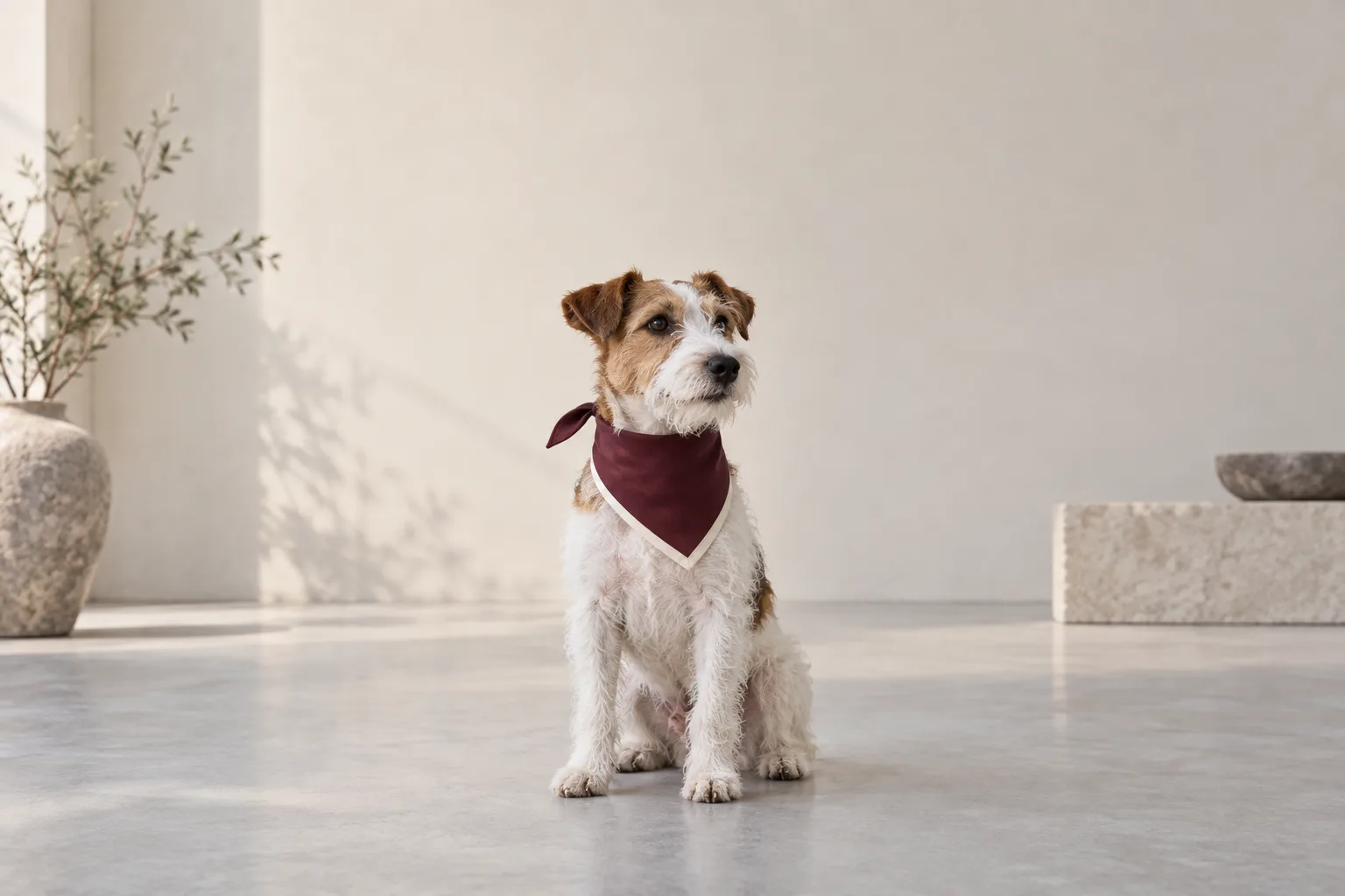
The dog's face survives every crop. The bandana does not.
In the square version, its pointed end disappears. In the tall version, the contrast border sits beneath interface buttons. The image is attractive in all three exports, but only one clearly shows the accessory being sold.
This is a composition problem worth solving before the shoot. A crop can remove space; it cannot recover a product detail that was never captured clearly.
For this planning exercise, use three working shapes: 1:1, 4:5, and 9:16. They are useful layouts to test, not universal platform specifications. The destination's current requirements, placement, and available preview still decide the final export.
Decide what must survive
Consider a fictional rust-colored dog bandana with a cream contrast border. Its triangular shape, visible border, and tied construction distinguish it from a plain neck scarf. Assume the physical sample and approved reference photographs confirm those details.
Write those three features on the shot list. Then identify the area of the frame that must contain them. The dog's eyes matter to the expression, but the accessory is the subject of the buying decision.
This distinction changes the camera position. A tight portrait centered on the eyes may leave too little room below the chin. Step back, adjust the angle, or choose a calmer pose that lets the bandana hang naturally. Keep enough of the product visible to understand its shape without turning the pet into a mannequin.
Try the narrowest crop before approving the master
Place rough outlines for the three planned shapes over a test image. Adjust each outline deliberately. They need not share exactly the same center, because a good square composition and a good tall composition may favor different space around the subject.
Check the narrow version early. If it cuts away the border or knot, the solution may be a wider original composition or a second photograph. Do not stretch the garment to fill the frame or rebuild its missing edge from imagination.
Next inspect the square. Does the accessory remain identifiable when the image becomes a small tile? Finally, inspect the 4:5 version. Is the extra height contributing useful context, or merely leaving a large ceiling above the dog?
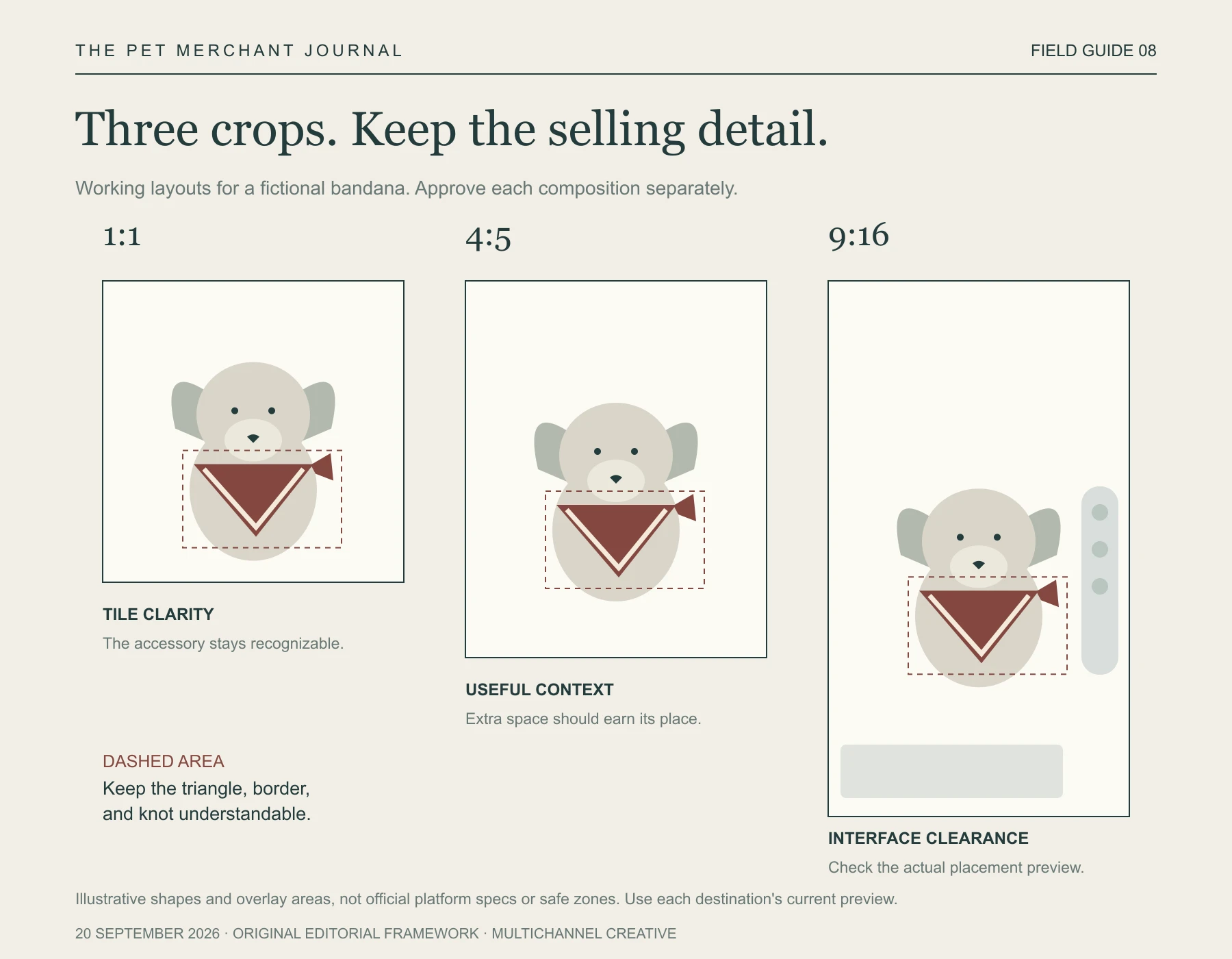
Original editorial framework. Use current destination specifications. Cropping may change emphasis; it must not invent or distort product features.
Reserve space for the actual destination
There are two different things to protect: the product from the crop, and the useful product detail from the interface.
TikTok's current in-feed advertising guidance, for example, explains that safe zones vary with dimensions, caption length, and additional formats. A generic transparent rectangle saved months ago is therefore an imperfect substitute for the current placement preview.
Use the destination's relevant safe-zone guidance for the export you are making. Check whether captions, controls, or a call to action cover the cream border that gives our fictional bandana its character. Move the composition or choose a different source frame when necessary.
For a Shopify storefront, a focal point can help protect the important area when a compatible theme crops an image. Shopify also notes that theme support matters and that the same image's focal point applies wherever it is used. That makes a live page check valuable: one setting cannot guarantee that every whole composition looks right.
Approve the product, then the layout
Keep an approved photograph of the actual bandana beside the campaign exports. The rust color, cream border, knot, and proportions should still describe the same item. A clever crop should change emphasis without changing the offer.
For our project, Tufty, this is a useful boundary for pet styling concepts: they can help explore a visual direction, while the actual product and approved references remain the basis for what a merchant publishes about the item.
Keep the full-resolution original. Export named versions for their intended placements, and check each at the approximate size a customer will see. A detail that looks wonderful at editing scale may become illegible in a compact card.
Know when one photograph has done enough
There is an understandable appeal to producing every asset from one master. It simplifies selection and can keep a campaign visually coherent. But a full garment view, a knot close-up, and a broad lifestyle scene do different jobs.
If preserving the entire bandana makes the dog too small in the vertical version, capture a dedicated vertical photograph. If the knot remains ambiguous, make a separate detail image. A second purposeful frame can be a more efficient choice than repeatedly rescuing an unsuitable one.
Before calling a shoot finished, put the planned crops side by side and ask whether each still makes the same product understandable.
The face can draw attention. The accessory needs room to explain why the customer should stay.