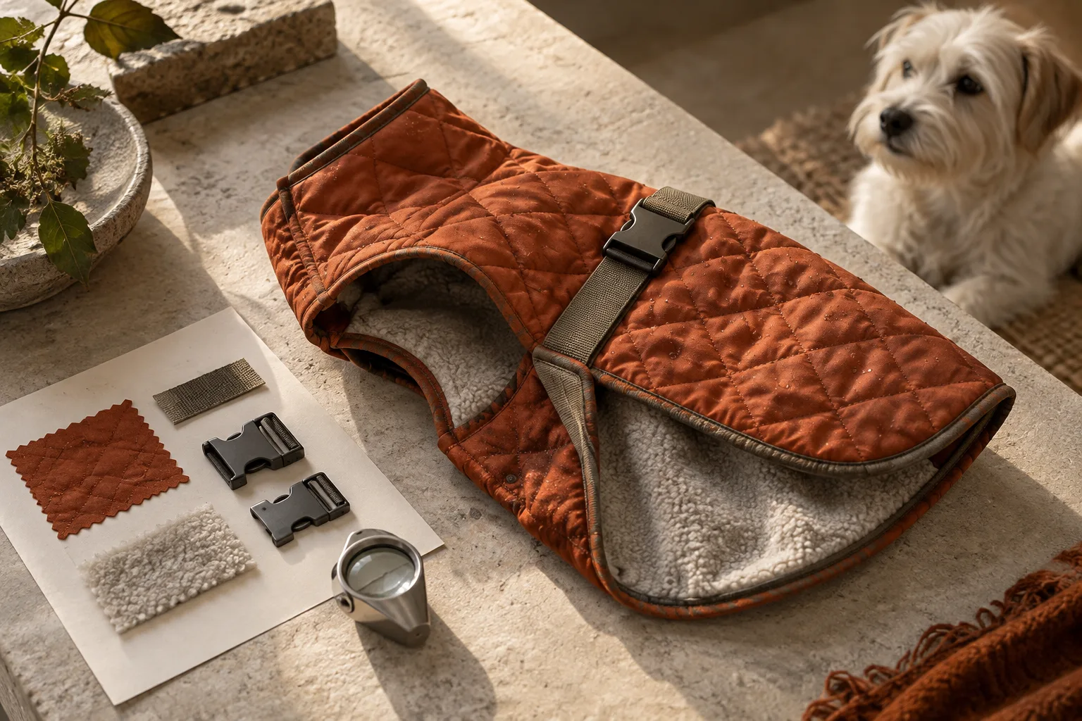
The dog is photogenic. The raincoat looks expensive. The opening banner could belong in a magazine.
Then a shopper asks whether the coat has an opening for a harness underneath. Nothing on the page answers them.
That is an expensive kind of ambiguity to leave inside a polished listing. The customer may leave, guess, or buy with an expectation the product cannot meet. More atmospheric photography will not resolve that particular problem.
For a pet apparel brand, a useful A+ brief begins with the decisions a customer must make. The visual identity should make those decisions easier to understand.
Amazon offers different A+ formats, with features depending on eligibility and content tier. Premium includes options such as Q&A and interactive modules; Basic supports image-and-text content. Check which formats your account can actually use before commissioning a layout.
The framework below is an editorial recommendation, independent of which modules you have.
Start with the objection that changes the order.
Imagine a sage dog raincoat with a back opening, an adjustable belly strap, and an unlined shell. This is an illustrative SKU, not a product claim about any existing brand.
“Does it come in sage?” is easy to settle with the selected color. “Will my harness work underneath it?” needs a more careful answer. “Is it warm?” might reveal that the shopper is considering entirely the wrong item.
Review your own support conversations, product questions, and return explanations. Separate a request for information from a product defect. A diagram can explain a closure. It cannot repair a closure that fails.
Then rank the unanswered questions by the consequence of getting them wrong. Frequency helps, but a less common question can still deserve space if a mistaken assumption makes the purchase unsuitable.
Assign evidence before assigning a module.
For the raincoat, the content brief might look like this:
| Customer decision | Evidence to prepare | What the copy must clarify |
|---|---|---|
| Can I use my harness? | Real photo of the back opening with the intended setup | Opening location and the configurations actually checked |
| Which size should I choose? | Measurement diagram based on the verified size specification | Where to measure and which measurements govern selection |
| Is this a winter coat? | Real shell and lining detail | Whether insulation or a lining is present |
| How does it fasten? | Open and closed views of the actual strap | Closure position and adjustment method |
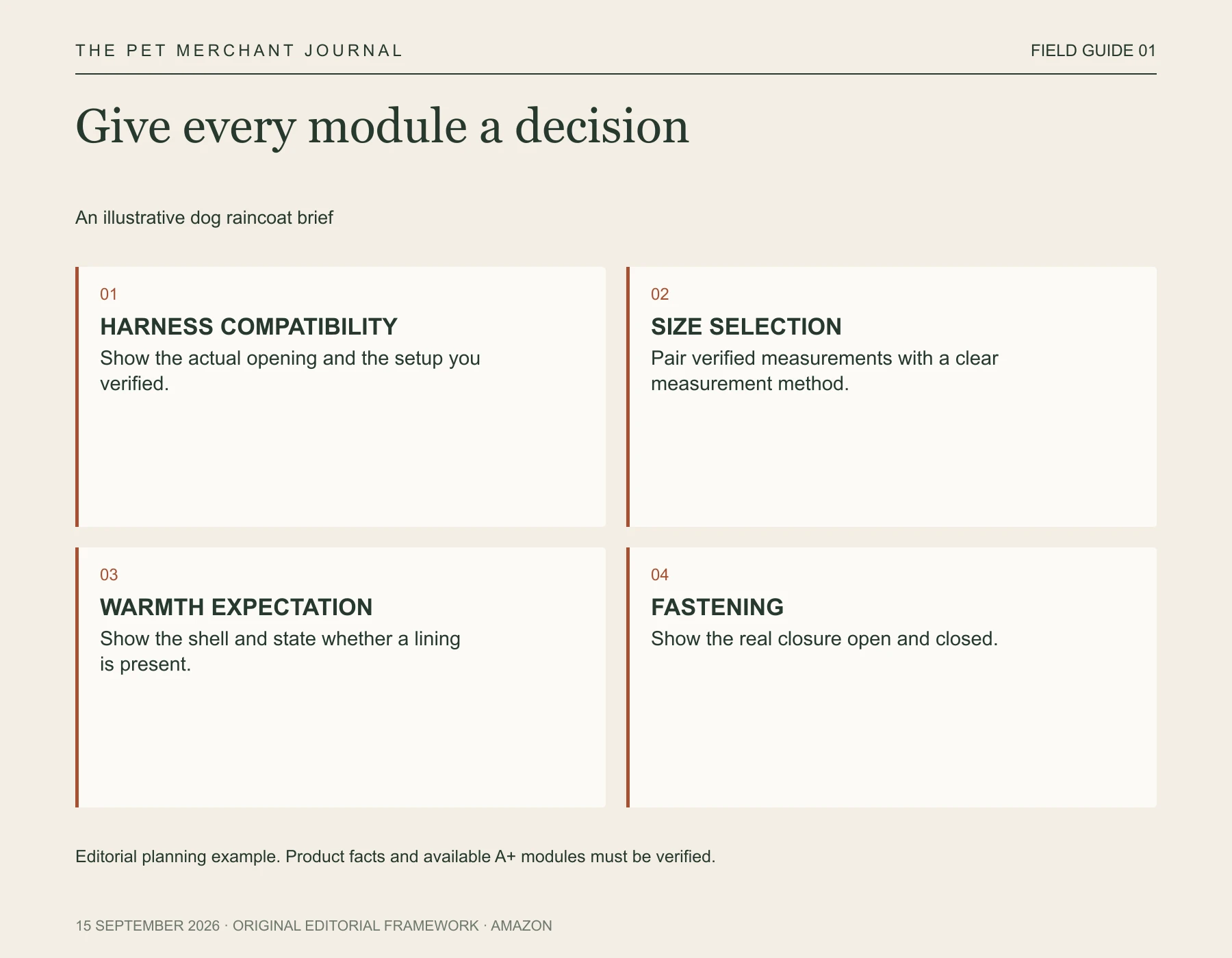
Original editorial framework. Editorial planning example. Product facts and available A+ modules must be verified.
Notice how little the creative team has to invent once the evidence is clear. The job becomes composition, emphasis, and explanation. “Premium comfort for every adventure” contributes less than a visible construction detail beside one specific sentence.
For compatibility, describe only the configurations you have actually verified. A photo of one harness underneath a coat does not establish that all harnesses fit. Useful specificity makes the boundary visible.
Put the difficult decision ahead of the beautiful repetition.
An opening lifestyle image can establish the setting. After that, give the customer something the main gallery has not already settled.
For this SKU, compatibility might come before the fabric story. A shopper who cannot use their preferred harness has no reason to admire another close crop of the shell. Another product may need the opposite sequence. A decorative bandana with straightforward sizing could reasonably lead with styling and material.
Amazon's design guide distinguishes Premium Q&A from other modules and provides a mobile preview workflow. It also places restrictions on promotional details, external links, and competitor comparisons in A+ content. Those are platform considerations; the proposed question order is a merchandising choice.
Review the page with the product out of reach.
Ask someone unfamiliar with the item to explain how it closes, how they would select a size, and what comes in the package. Let them use the page, without coaching. Record where they hesitate and what they infer incorrectly.
This is a comprehension review, not evidence of a conversion lift. Its value is locating missing explanations before spending more on content.
We are developing Tufty for AI pet styling concepts. In a workflow like this, concept imagery could help explore the setting; photographs, measurements, and verified product information still have to carry the factual explanation.
There is a reasonable limit to this exercise. A+ cannot fix an inaccurate title, a confusing variation selector, or a weak product. Nor should every possible question become another block of copy. Keep the questions that materially affect suitability; trim the rest.
A beautiful page earns attention. A useful page gives that attention somewhere to go. Before approving your next banner, finish this sentence: “After seeing this, the customer can decide whether…”
If the answer is still vague, the brief is not finished.