
A merchant sees coats, sweaters, harnesses, and accessories. A shopper sees tomorrow morning: a short walk before work, a dog that dislikes having clothing pulled over its head, and a harness that still needs to connect to the leash.
Only one is thinking in product types.
Product categories are useful. But when every collection repeats the stockroom's organization, the customer must translate a practical problem into your internal vocabulary before shopping can begin.
The opportunity is to give buying situations their own entry points, then make those pages precise enough to be useful.
Write the mission before the collection name
Start with a complete sentence: “I need a layer my dog can wear on walks with our existing harness.” That sentence already suggests which information matters: attachment access, opening position, fastening method, coverage, and fit.
“Adventure Essentials” sounds like a campaign. It tells the shopper very little about whether the products will work together.
Consider an invented catalog containing a wrap-front fleece, a pullover knit, a lightweight shell with a documented harness-access opening, and decorative bandanas. A useful collection could focus on layers with harness access. Its membership would depend on the actual construction of each product. An attractive pullover without that feature would stay out, even if it looked perfect in the campaign photograph.
This is where merchandising becomes an editorial discipline: a collection has a promise, and each included product must support it.
Shopify's collections documentation supports grouping products for shopping contexts as well as categories. Its current guidance also describes a transition to a new collections model, so the controls available in an individual admin may differ. Build the customer proposition first, then use the membership tools available in your store.
Give the promise a data model
A collection title cannot carry the experience. The product information underneath needs to be consistent enough to compare.
In the invented catalog, record “harness access” as a defined attribute. Record where the opening sits. Keep fastening type, material composition, care instructions, and each SKU's sizing information separate. Use controlled terms so one supplier's “step in,” another's “step-in,” and your editor's “easy dressing” do not quietly become three different features.
Some details belong to a product; others vary with the size or color purchased. Store them at the level where they are true. A photograph of one sample cannot establish that every variant shares its construction.
| Shopping mission | Useful collection promise | Detail that makes it credible |
|---|---|---|
| Walk with an existing harness | Layers with a documented access opening | Opening position and compatibility guidance |
| Avoid pulling a garment over the head | Wrap or opening-front designs | A visible fastening sequence |
| Choose a washable everyday layer | Products with clearly stated care | Actual washing and drying instructions |
| Buy a personalized gift | Products with an explained custom-order process | Choices, production timing, and packaging details |
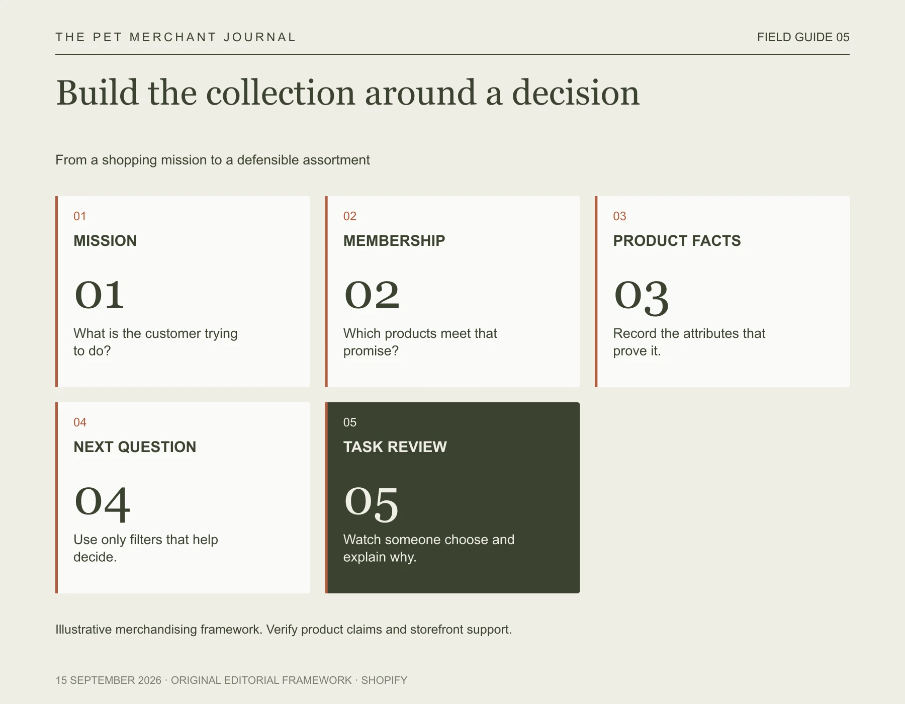
Original editorial framework. Illustrative merchandising framework. Verify product claims and storefront support.
Treat these as illustrative collection concepts, not claims about a particular dog or garment. For the harness example, even an opening does not establish compatibility with every harness. The page should help the customer check the arrangement they actually use.
Make filters answer the next question
Shopify Search & Discovery can build custom filters from product options and structured fields. Display depends on a compatible theme or supported custom storefront. Its documentation also identifies translation limits for tag and vendor values, so a tag-heavy structure deserves particular care in an international store.
Choose filters by watching the decision unfold. Once someone has found the right type of layer, they may need fastening type and an available size. Show a consistent size label, but keep the product-specific measurement guidance one click away; “Medium” is not evidence that two differently cut garments fit the same dog.
Resist turning every field into a filter. A six-product collection may be clearer with a short comparison block. Twenty nearly empty filter choices can make a modest assortment feel more complicated than it is.
Let the photograph explain the grouping
The lead image should make the collection's purpose legible. For the harness-access collection, a real demonstration of the opening is more informative than a row of dogs in a beautiful landscape. Keep your strongest mood photography, but place it where it can add atmosphere without carrying an unsupported functional claim.
When considering visual concepts in our project, Tufty, this is the boundary we would apply: an AI styling idea may help explore a campaign's mood; compatibility evidence must come from the actual products and setup.
Test the collection with a concrete task. Ask someone to find a suitable candidate, explain why they chose it, and identify what they still need to verify. Record the missing answer before changing the page again.
A good collection does more than display stock. It gives a customer's next walk a sensible starting point.